
What do you think to yourself when you see someone’s Twitter avatar is the default image of an egg? Chances are, you probably assume they are either inactive, a fake account, or someone not worth following.
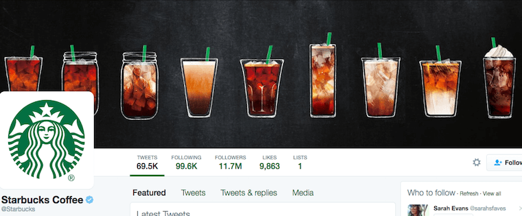
While almost all businesses understand that the egghead approach isn’t doing them any justice, they often fail to understand that a plain, flat Twitter cover photo can be equally as off-putting to potential followers.
What do you think to yourself when you see someone’s Twitter avatar is the default image of an egg? Chances are, you probably assume they are either inactive, a fake account, or someone not worth following.
While almost all businesses understand that the egghead approach isn’t doing them any justice, they often fail to understand that a plain, flat Twitter cover photo can be equally as off-putting to potential followers.

Choosing any color scheme — whether for graphics, websites, brands, etc. — is a challenge in and of itself. That choice of colors sets the mood for anything and everything you create.
When it comes to data visualization, color is especially important. The color scheme sets the tone of the imagery and each color serves to represent a unique piece of information.
Choosing any color scheme — whether for graphics, websites, brands, etc. — is a challenge in and of itself. That choice of colors sets the mood for anything and everything you create.
When it comes to data visualization, color is especially important. The color scheme sets the tone of the imagery and each color serves to represent a unique piece of information.
Choosing any color scheme — whether for graphics, websites, brands, etc. — is a challenge in and of itself. That choice of colors sets the mood for anything and everything you create.
When it comes to data visualization, color is especially important. The color scheme sets the tone of the imagery and each color serves to represent a unique piece of information.
Choosing any color scheme — whether for graphics, websites, brands, etc. — is a challenge in and of itself. That choice of colors sets the mood for anything and everything you create.
When it comes to data visualization, color is especially important. The color scheme sets the tone of the imagery and each color serves to represent a unique piece of information.
Choosing any color scheme — whether for graphics, websites, brands, etc. — is a challenge in and of itself. That choice of colors sets the mood for anything and everything you create.
When it comes to data visualization, color is especially important. The color scheme sets the tone of the imagery and each color serves to represent a unique piece of information.
Choosing any color scheme — whether for graphics, websites, brands, etc. — is a challenge in and of itself. That choice of colors sets the mood for anything and everything you create.
When it comes to data visualization, color is especially important. The color scheme sets the tone of the imagery and each color serves to represent a unique piece of information.
Choosing any color scheme — whether for graphics, websites, brands, etc. — is a challenge in and of itself. That choice of colors sets the mood for anything and everything you create.
When it comes to data visualization, color is especially important. The color scheme sets the tone of the imagery and each color serves to represent a unique piece of information.
Choosing any color scheme — whether for graphics, websites, brands, etc. — is a challenge in and of itself. That choice of colors sets the mood for anything and everything you create.
When it comes to data visualization, color is especially important. The color scheme sets the tone of the imagery and each color serves to represent a unique piece of information.