
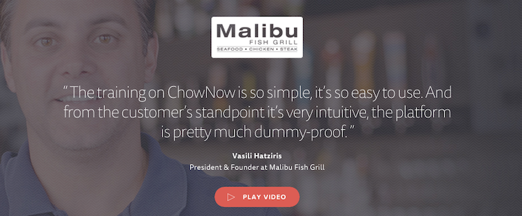
When potential customers are researching you online, they’re getting to know you by way of the content of your website. Understandably, many of them might be skeptical or hesitant to trust you right away.
To prove the value of what you have to offer, why not let your happy customers do the talking?

When it comes to delighting people with design, details matter — a lot. The fonts you choose every time you lay out an email, an ebook, or an image for social media end up giving your marketing a polish that makes a big difference.
Trouble is, with so many options to choose from, finding the right one isn’t always as obvious as we’d like it to be. Thankfully, there are a few guiding principles out there to simplify the selection process.
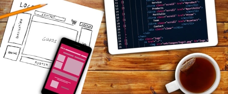
When the time finally comes to tackle a website redesign, it’s difficult to contain the excitement. There are so many things you just can’t wait to have put into place! Then come the first steps to making it all happen.
Excitement turns to fear and trepidation as you try to craft a plan and put together the resources to turn all of your lofty ideas into reality. Suddenly it begins to seem more and more like a home construction project: lots of advice from many sources; warnings about rip-offs, scams and slick tactics; choices for things that could go into, on and throughout your new website; decisions about who should do what, how long it should take, and how much it should cost. Finally, you’re lost in so many details that you’re not sure where to start.
Here are the most common red flags that your website redesign is not on the path to providing value and what you can do to avoid them.

It’s not uncommon to feel like marketers and designers speak different languages. You have marketers focusing on the timeline, designers focusing on the creation process, and neither of them understanding where the other is coming from.
For example, less than 30% of marketers say designers are anticipating problems and following a transparent process.
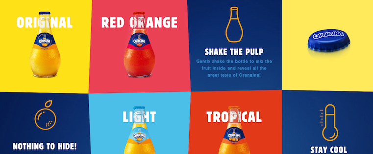
If you look at how product pages take shape across different companies, it’s clear that they run the gamut. Some go for the direct approach, displaying an image of a product and explaining why someone should buy it. Other companies create elaborate pages with moving parts and fancy coded elements.
Of course, some companies fare better than others at creating delightful product pages.

If you experience both pain and relief when reading the title of this post, you’re in the right place.
As marketers, there’s a story that we know all too well. It starts with a meticulously planned email campaign, a carefully selected group of recipients, and a beloved email template to deliver your content exactly as you intended.

Website uptime — the amount of time a business’ website is up and functioning — is an important metrics for marketers and IT professionals to track. But no matter how many resources you put into ensuring your website never, ever, ever goes down … there’s always the looming possibility that it might.
It’s a bummer, but a fact of life. And the reaction of visitors when they land on your temporarily unavailable website can run the gamut — from “taking it in stride” to “totally losing their minds.”

If you’ve spent any time on the internet at all, you’ve probably come in contact with an animated GIF. It’s an image file that allows you to feature animated images that makes it seem like the image is moving. Think of them as a hybrid between a still image and a video.
Why are GIFs great additions to your marketing? They’re easy to consume, provide a new way to capture your viewers’ attention, and can have a serious emotional impact.

Gone are the days where “I’m not creative enough” or “I don’t have any design experience” serve as sound excuses for avoiding design entirely. Thanks to new technology, it’s possible for pretty much anyone to create optimized graphics to support their campaigns and lead generation efforts.
With photos in tweets averaging a 35% boost in retweets and captions under graphics being viewed 300X more than body copy on average, compelling graphics have become an increasingly important part of the marketing plan.
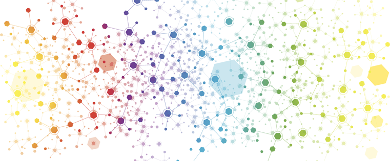
Data can be very powerful. If you can actually understand what it’s telling you, that is.
It’s not easy to get clear takeaways by looking at a slew of numbers and stats. You’ve got to have the data presented in a logical, easy-to-understand way.
Enter data visualization. The human brain processes visual information better than it processes text — so using charts, graphs, and design elements, data visualization can help you explain trends and stats much more easily.