
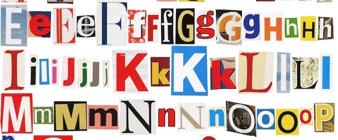
You don’t always need graphics, photos, or images to make your design pop — sometimes the right font does the trick. But going to every corner of the internet isn’t feasible for most designers and marketers. You’ve got projects to create, often on deadlines that are way too tight. You’ve also got a fairly strict budget that you can’t blow installing a font here or there that might work with your designs.

Eye-catching, on-brand color schemes. Big, bold images. Striking headlines.
These are all important parts of great website design. After all, they’re what can make or break a new site visitor’s first impression of your site. But what about the more nitty-gritty parts of great website design — like helpful navigation menus, strong calls-to-action, and indicators of website security and trust?

Every year, we see new elements and styles in website design begin to emerge.
Some elements — when incorporated thoughtfully — help tell stories and explain your company. Other elements work to improve how content looks on a specific device. While it’s not necessary to include every trend that comes about on your website, many of them have the potential to improve your visitor’s experience.

WYSIWYG. No, this isn’t another one of those newfangled acronyms the kids are using these days — it’s actually been around for quite some time.
“What You See Is What You Get,” or WYSIWYG for short, refers to an HTML editor in which the content appears as it would when it’s live.

How do our brains react to advertisements?
Well, it depends on the ad. It takes 250 milliseconds for the brain to absorb visual cues, but only 13 milliseconds for images to elicit emotion — even if you aren’t fully absorbing what you’re seeing. So if you want to create more effective advertisements, you should use design and copy that foster an emotional response in your viewers.

Cool topic? Check. Compelling research? Check. Accurate data? Check, check.
When you’re sitting down create an infographic, it’s never a good idea to just jump in, translate all that research into bite-sized pieces one after the other, and hope people like it. Infographics don’t just randomly become popular — there’s a science to it.
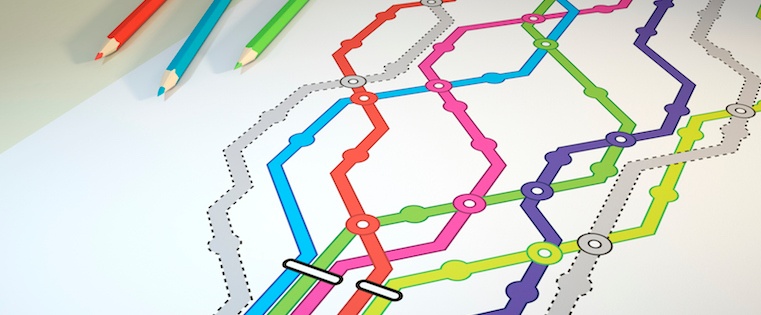
If you were to design a subway map, what would you design for: geographical precision or visual clarity? Is it better for a map to accurately represent the geography at street level, or for it to be abstract and easy-to-understand?
In 1972, Massimo Vignelli chose the latter — visual clarity — when he designed a map of the New York City subway system.

It’s really tempting to let terrible Excel graphs creep into your marketing. Your boss doesn’t care about little things like how graphs look, right? And whatever Excel comes up with as the default is probably fine … right?
Not really. You’re using data to spur action. Maybe you pull data to convince your boss to adopt inbound marketing, give you an extra sliver of budget, or adjust your team’s strategy — among other things.

When you break a landing page down to its most basic level, you’re left with a few things: a catchy headline, a form, a few bullet points, and maybe a supporting visual.
These elements are often combined in a similar format, dressed up with the branding of the company, and pushed live with the hope that they’ll be enough to invite engagement.

There are a lot of things I used to buy in person that I now buy online. I wouldn’t call myself lazy, but it’s just so much easier to carry a box of paper towels from my doorstep into my apartment than it is to carry it down the street from my local grocery store.
And I’m not alone. Whether it’s because of the larger selection, better pricing, convenience, or something else, a lot more people are buying stuff online nowadays instead of in person.