

Think about the average college’s website for a second.
Chances are, it feels a little out of date. You probably can’t even read its content on your phone without lots of pinching and zooming.
Crazy right? It’s the virtual front door of the campus.

It’s no secret that infographics serve as an interesting way to serve up information in a visually appealing way. But for those of us that lack design skills, the creation process can seem a little intimidating.
Where do you start? What data should be represented? Which colors work best? How should it be formatted?
This post originally appeared on HubSpot’s Agency Post. To read more content like this, subscribe to Agency Post.
Between the bowl cuts and missing teeth, there’s nothing quite worse than looking back on a pile of your old school photos.

“Comic Sans is the best joke I ever told,” tweets the font’s creator, Vincent Connaré.
Between websites like BanComicSans.com and an online petition against the typeface with over 5,000 signatures, it’s clear that people don’t just hate Comic Sans … they really hate Comic Sans.
But why?

This post originally appeared on HubSpot’s Agency Post. To read more content like this, subscribe to Agency Post.
There’s no question that men and women think and communicate differently. Sometimes it feels like we’re from different planets, right?

Infographics that really stand out are far more than just a smattering of pictures and charts. They might tell an engaging story — one built around compelling data, graphics, or illustrations. Or perhaps they serve as a really helpful visual resource.
While great infographics come in a variety of forms, the common thread is that they’re visually pleasing and designed in a way that makes complex topics easy to understand whether you’re a novice in the subject or an expert.

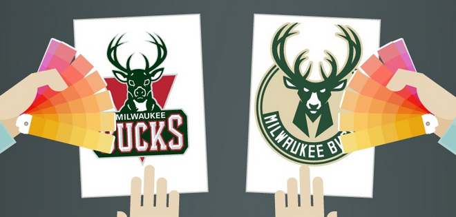
What makes a college logo great?
Think back to the logo of your own alma mater. Was the design simple and clean? Was it easily recognizable? Will it still be a great logo in 10, 20, even 50 years? Did it resonate with you and your classmates?
This post originally appeared on HubSpot’s Agency Post. To read more content like this, subscribe to Agency Post.
A logo redesign can be a risky undertaking.
When The New York Times removed the period from its logo in 1967, many were outraged at the change, which was supposed to save the paper on ink costs.

This post originally appeared on inbound.org and is reprinted here with permission.
The purpose of any homepage is to act as a launching pad for users to find relevant information that’s specific to their needs. Deciding what to include on your homepage, however, is an endless conversation amongst marketers.

Visual content is in high demand. Just about every piece of content you create can be enhanced by some kind of visual element. In fact, content with relevant images gets a whopping 94% more views than content without relevant images.
And in social media, visuals pretty much make or break your presence. According to Buffer, visual content is more than 40X more likely to get shared on social media than other types of content.